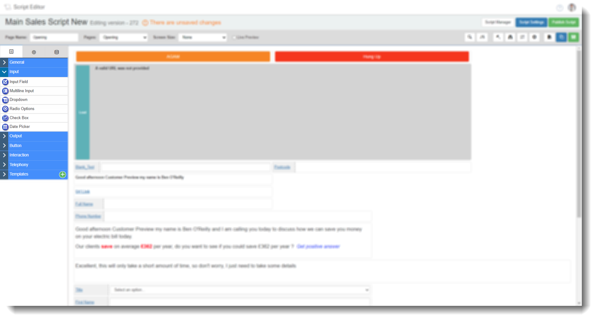
Drag and Drop Fields — Input
The Input tab in the Field Options panel contains six field types for collecting or selecting data during a call: Input Field, Multi-line Input, Dropdown, Radio Options, Check Box, and Date Picker. Drag any of these onto a script page to add them, then select the edit icon to configure.
Most input field types share a common Database tab. Where this applies, it is noted in the field description and the full Database tab settings are documented once in the Database tab section at the end of this article.
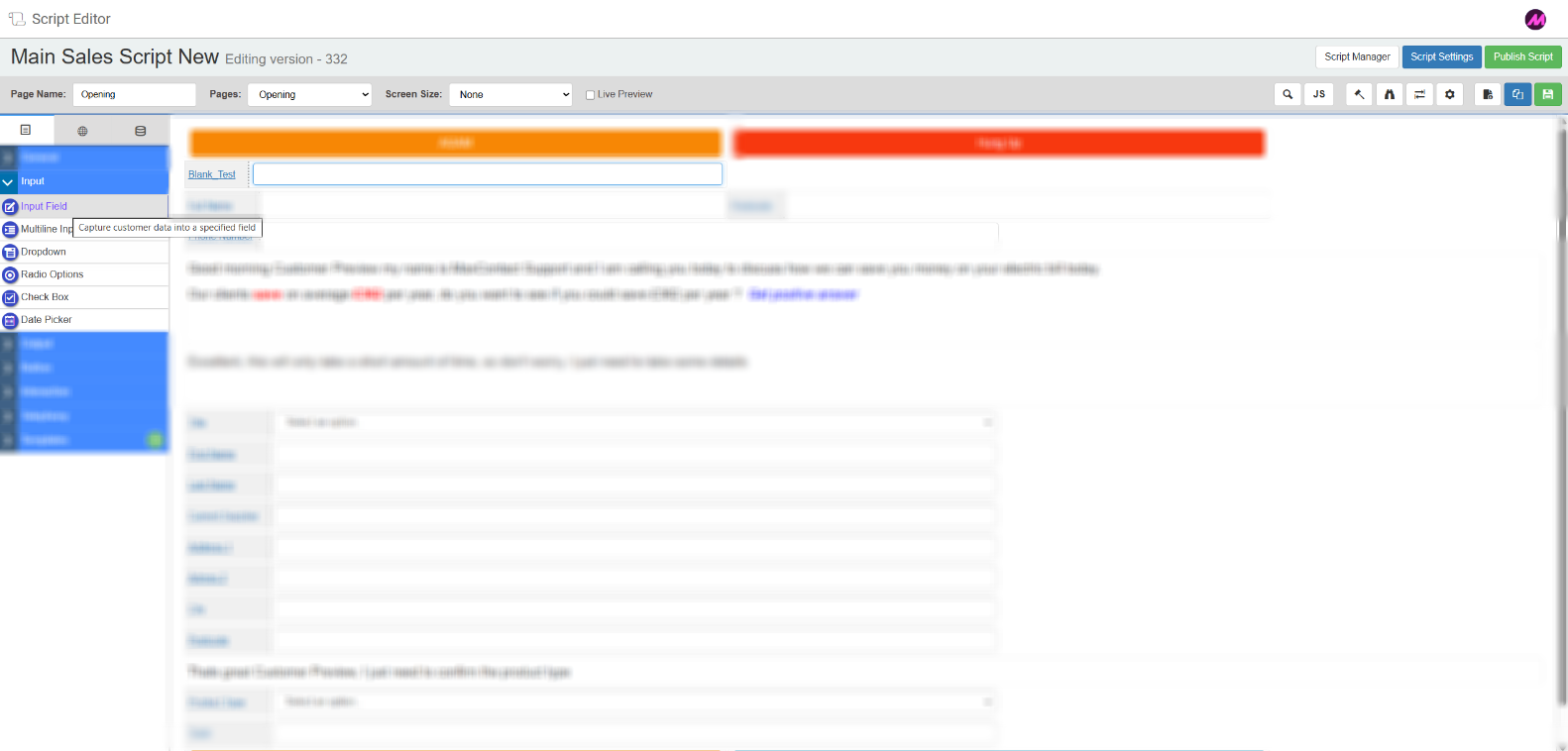
Input Field
A single-line text field that lets agents view and update lead information during a call. If lead data has been mapped on import, the relevant field will be pre-populated when the script loads and the agent can edit it. To collect new information not imported with the lead, map this field to a database column using the Database tab.
Tab 1 — Field Config
| Setting | Description |
|---|
| Reference name | The system-generated reference for this field. Can be edited. |
| Label | The field name displayed on the script. Can be edited. |
| Resource table | Optionally link a resource table to this field — for example, to enable a postcode lookup. See Dropdown Lists for more detail on resource tables. |
Tab 2 — Field Style
| Setting | Description |
|---|
| Visible | Controls whether the field is visible on the script when it loads. |
| Read only | When enabled, agents can view the field but cannot edit it. |
| Bold label | When enabled, the field label text is displayed in bold. |
Tab 3 — Validation
| Setting | Description |
|---|
| Required | When enabled, the script will not navigate away from the page unless this field has been completed. |
Validate on load
| When enabled, validation is checked as soon as the field is populated on load. When disabled, validation is only checked when the agent modifies the field value.
|
Min length
| The minimum number of characters required. Any value shorter than this will fail validation.
|
Max length
| The maximum number of characters allowed. Any value longer than this will fail validation. |
Tab 4 — Advanced Validation
Applies a validation pattern to restrict what agents can enter. The script will not allow the page to be navigated away from until the value meets the selected pattern.
| Option | Description |
|---|
| UK phone number | Numeric, 11 digits. |
| UK postcode | Validated using regex rules for UK postcode format. |
| SA postcode | Validated using regex rules for South African postcode format. |
| Credit card | Validated using regex rules for credit card number format. |
| Email | Requires an @ symbol with at least one full stop. |
| Current pattern | Retains the existing validation pattern rather than replacing it. |
| Custom regex | Enter your own regex expression to validate against any custom format. |
Tab 5 of the Input Field is the Database tab. See the Database tab section below.
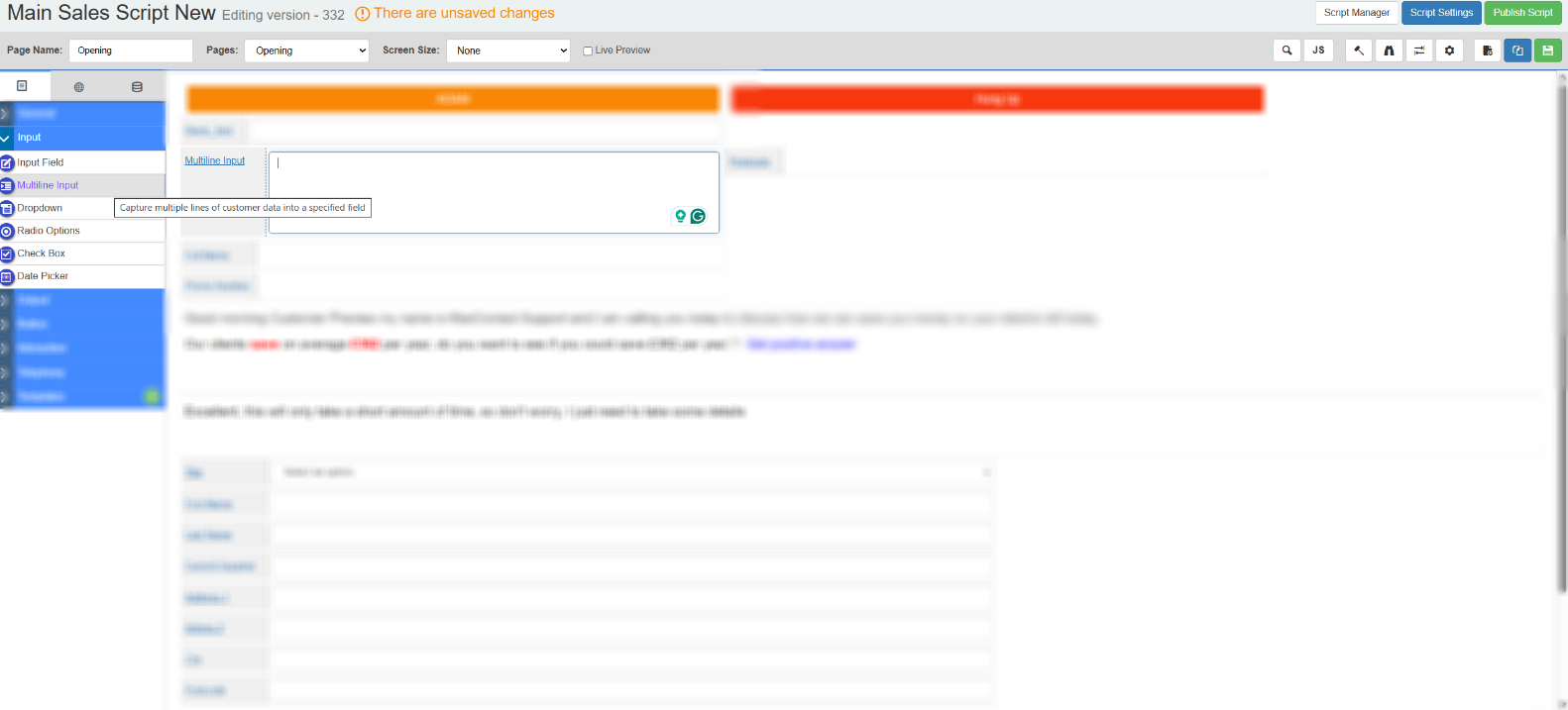
Multi-line Input
A text area that accepts multiple lines of input. Useful for capturing notes or longer free-text responses during a call.
The Multi-line Input has the same tabs as the Input Field with one exception: Tab 1 does not include the Resource Table option. All other tabs — Field Style, Validation, Advanced Validation, and Database — are identical.
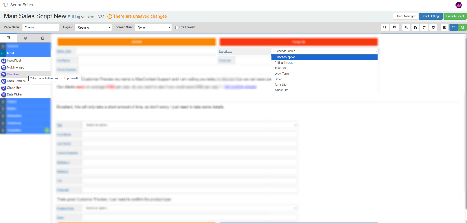
Dropdown
Presents agents with a list of options to select from. Options can be entered manually or populated from a resource table (Dropdown Lists). The selected value is written back to the linked database field.
Tab 1 — Field Config
| Setting | Description |
|---|
| Reference name | The system-generated reference for this field. Can be edited. |
| Label | The field name displayed on the script. Can be edited. |
| Options | Enter each option you want to appear in the dropdown, one per line. |
| Resource table | Populate the dropdown from a pre-uploaded resource list instead of entering options manually. For example, a list of energy suppliers can be uploaded once and reused across scripts rather than typed out each time. See Dropdown Lists for more detail. |
Tab 2 — Field Style
| Setting | Description |
|---|
| Visible | Controls whether the field is visible on the script when it loads. |
| Read only | When enabled, agents can view the field but cannot change the selection. |
| Bold label | When enabled, the field label text is displayed in bold. |
Tab 3 — Validation
| Setting | Description |
|---|
| Required | When enabled, the script will not continue unless a selection has been made. |
Tab 4 of the Dropdown is the Database tab. See the Database tab section below.
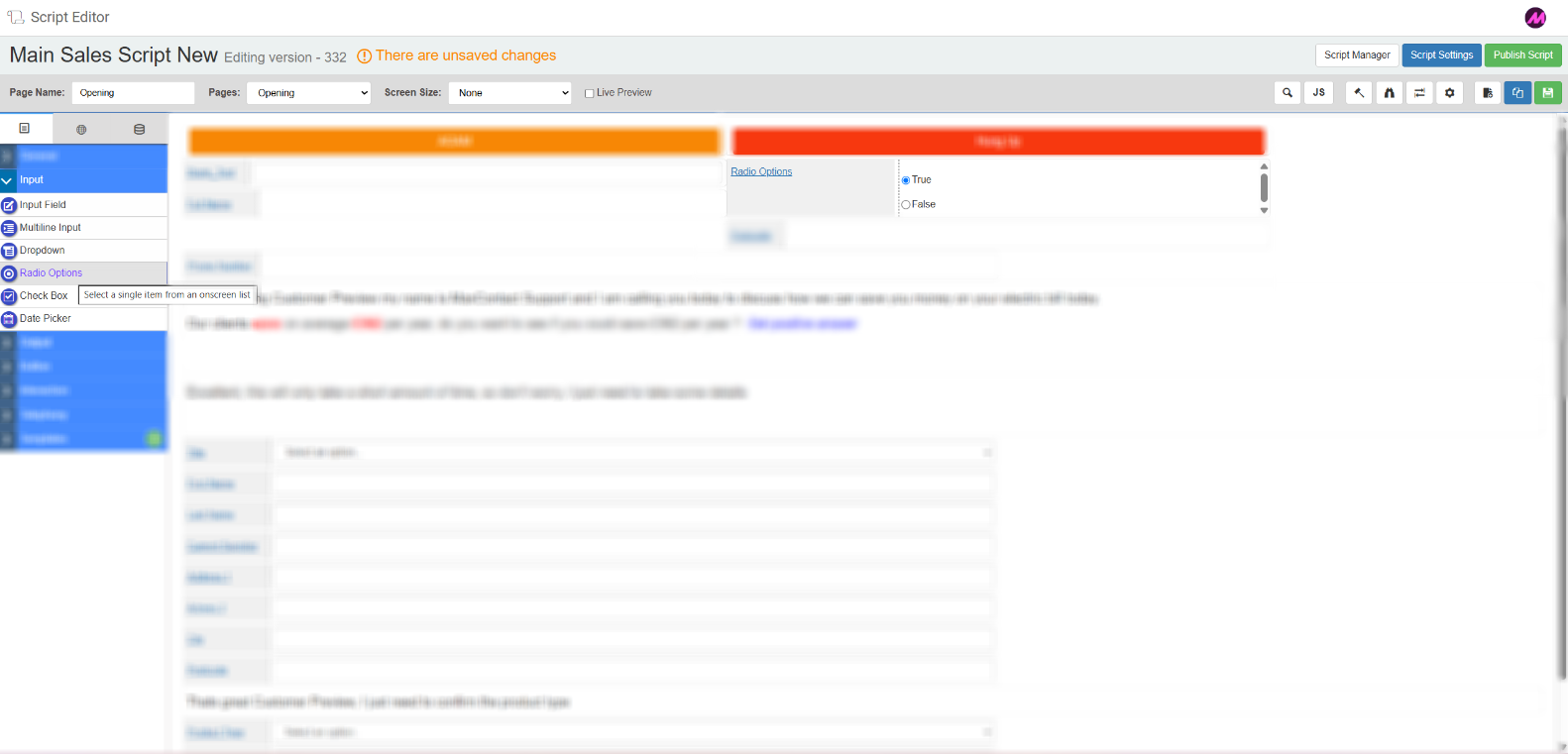
Radio Options
Presents agents with a set of selectable options displayed as radio buttons. Only one option can be selected at a time. The selected value is written back to the linked database field.
Tab 1 — Field Config
| Setting | Description |
|---|
| Reference name | The system-generated reference for this field. Can be edited. |
| Label | The field name displayed on the script. Can be edited. |
| Options | Enter each option to display as a radio button, one per line. |
| Resource table | Optionally populate the options from a resource list rather than entering them manually. |
Tab 2 — Field Style
| Setting | Description |
|---|
| Visible | Controls whether the field is visible on the script when it loads. |
| Read only | When enabled, agents can view the selection but cannot change it. |
| Alignment | Sets whether the radio options are displayed horizontally or vertically. |
| Bold label | When enabled, the field label text is displayed in bold. |
Tab 3 — Validation
| Setting | Description |
|---|
| Required | When enabled, the script will not continue unless an option has been selected. |
Tab 4 of the Radio Options field is the Database tab. See the Database tab section below.
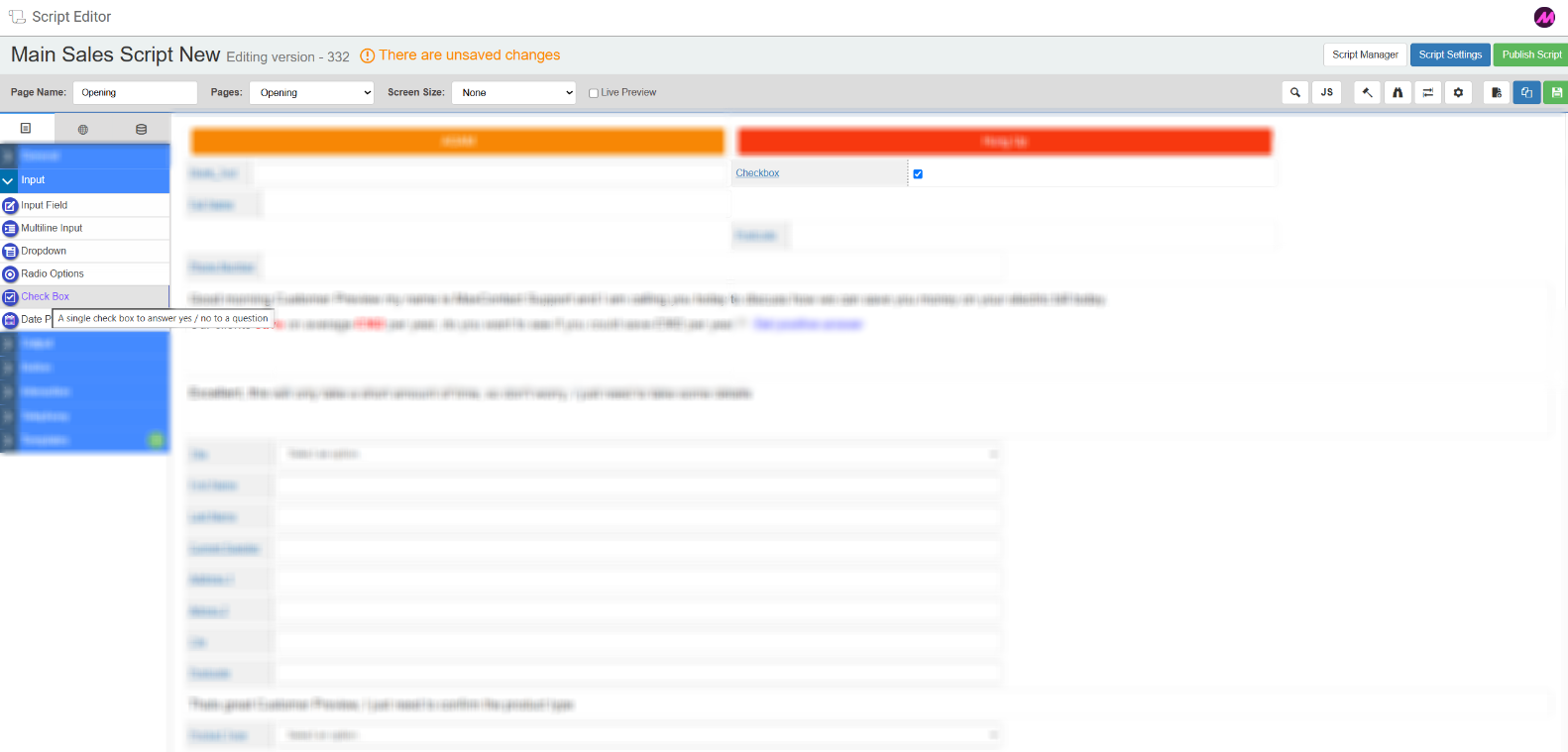
Check Box
A simple tick box that agents can check or uncheck. The checked/unchecked state is written back to the linked database field.
Tab 1 — Field Config
| Setting | Description |
|---|
| Reference name | The system-generated reference for this field. Can be edited. |
| Label | The field name displayed next to the check box. Can be edited. |
Tab 2 — Field Style
| Setting | Description |
|---|
| Visible | Controls whether the field is visible on the script when it loads. |
| Bold label | When enabled, the field label text is displayed in bold. |
Tab 3 of the Check Box field is the Database tab. See the Database tab section below.
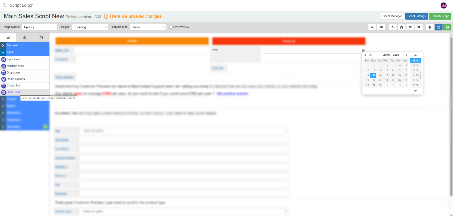
Date Picker
Lets agents select a date, time, or date and time using a picker. The value is written back to the linked database field. Make sure the field type in the database matches the date picker type selected here.
Tab 1 — Field Config
| Setting | Description |
|---|
| Reference name | The system-generated reference for this field. Can be edited. |
| Label | The field name displayed on the script. Can be edited. |
| Date picker type | Choose between Date & Time, Date only, or Time only. |
Tab 2 — Field Style
| Setting | Description |
|---|
| Visible | Controls whether the field is visible on the script when it loads. |
Read only
| Makes the field read-only. |
| Bold label | When enabled, the field label text is displayed in bold. |
Tab 3 — Validation
| Setting | Description |
|---|
| Required | When enabled, the script will not continue unless a date has been selected. |
Tab 4 — Advanced Date Validation
| Setting | Description |
|---|
| Use default date | Sets a date to display when there is no existing value for the lead. Defined as an offset from today — for example, now + 60 minutes. |
| Allow past dates | When disabled, agents cannot select a date in the past. |
| Check upper and lower limit | Restricts the selectable date range to within a specified number of days in the past or future. |
| Use min and max dates | Sets a specific date range that the selected value must fall within. |
| Validate age range | When enabled, checks that the entered value falls between two specified ages (in years). Useful for age verification during a call. |
Tab 5 of the Date Picker is the Database tab. See the Database tab section below.
Database tab
The Database tab is present on the Input Field, Dropdown, Radio Options, Check Box, and Date Picker field types. It controls how the field links to your data tables.
| Setting | Description |
|---|
| Use database field or global field | Choose whether to populate this field from a database column or from an existing global field on the script. |
| Duplicate script fields | Shows any other fields in the script linked to the same database column. Changes to one will affect the other. |
| Select customer data table | Select the data table you want to link this field to. |
| Choose database field | Select the specific column from the chosen table to link to this script field. |
| Create a new field | Opens options to create a new database field if the one you need does not exist. |
| Create a new table | Opens the Contact Data Tables page in a new tab where you can create a new data table. |
Related articles