Dashboard Widgets — Charts
Chart widgets display your data visually on dashboards and wallboards. This article covers the two Chart widget types and the settings available within them.
| Widget | Description |
|---|---|
| Bar Chart Widget | A configurable chart available in four graph types, used to compare two stats over time for a selected data type. |
| Funnel Widget | A summary graphic showing current Calls, Connect Rate, DMC Rate, and Conversion Rate. |
Bar Chart Widget
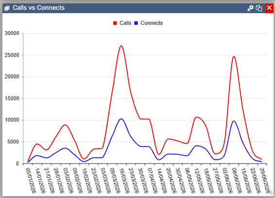
The Bar Chart widget is available in four graph types: Line Chart, Bar Chart, Column Chart, and Area Chart. Select the settings icon to configure it.
| Setting | Description |
|---|---|
| Data Type | Select the data type to display — Campaign, List, Team, or User. |
| Graph Type | Select from Line Chart, Bar Chart, Column Chart, or Area Chart. |
| Show Legend | Displays a key showing which colour corresponds to each data option. |
| Data to Display | Select up to two stats to display on the chart. Calls vs Connects Connects vs Contacts Contacts vs Successes Contacts vs SPH Contacts vs Conversion Connects vs Burns Calls vs Successes Decision Maker Contacts vs Successes SPH Yesterday vs Today |
| Date Range | Select from four pre-determined date ranges. Today, This Week, This Month, and This Year. |
| Time Interval | The available options here change depending on the Date Range selected above. |
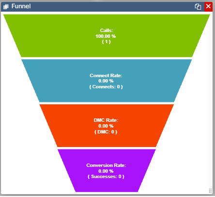
Funnel Widget
The Funnel widget is a simple graphic summarising current stats for Calls, Connect Rate, DMC Rate, and Conversion Rate.